
This is our DRAFTING page. In order to create a successful magazine front cover and film poster, we first had to undertake extensive research on existing horror magazine front covers and existing film posters to get a feel for what we would be creating ourselves. Below we have chosen 5 magazine front covers and 5 film posters we particularly liked and explain what we like about them and what we hoped to use as an influence for our own final products. As well as this, below you will also find a series of drafts, either hand drawn or Photoshop, that really marks the beginning process of making our final products.

Existing Horror Magazine Front Covers
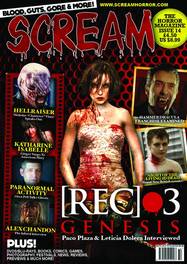
What we really liked about this magazines front cover was the film strip on the left-hand of the magazine. As a group we found this to be a very nice way to display the magazines cover-lines and have made plans to replicate something similar in our own front cover design possibly with some sort of twist or element of originality.
|
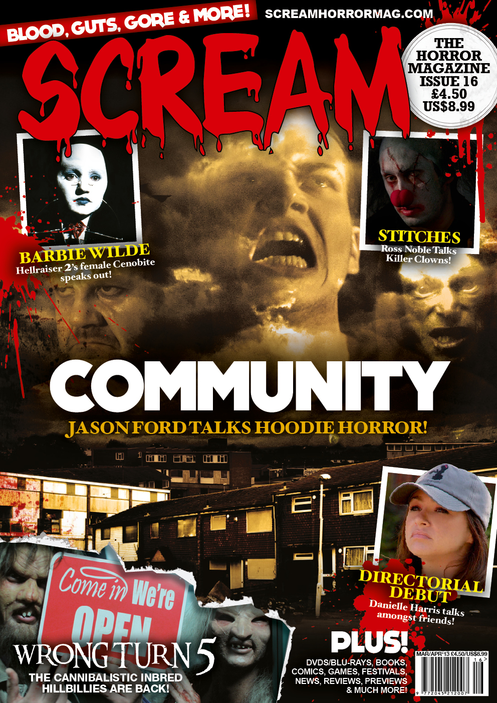
There was a lot about this particular horror magazine cover that we liked and felt that this could possibly be our biggest influence going into designing our own front cover. We liked the word 'Horror' being placed in the top left corner because it allows readers to identify the magazines genre even if they are stacked across the shop shelves. We thought the colour scheme was quite nice and the colours used in the image worked really well. We particularly liked the way in which the cover-lines were displayed because it is original and still presented nicely. The blood effect on the font was a nice touch too.
|
We thought that the tear effect used in the bottom left of the page was really good and hoped to be able to do something similar with our own cover. We also liked the main image on the cover and in particular how it blends into black at the top of the magazine cover.
|
It was the magazines masthead that first caught our attention and this was partly why we chose it as an influence for our own horror magazine front cover. The fact the entire magazine front cover, including colour scheme, has been designed purely around the featured film is something we wish to do with our own work too. Lastly we liked the way the cover-lines were presented at the bottom of the page although we may not include that in our designs.
|
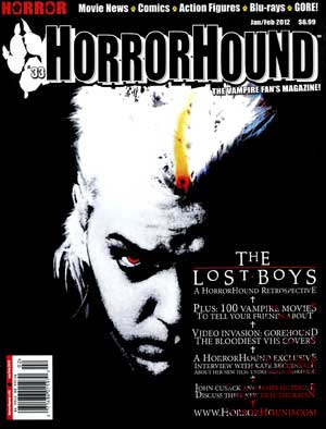
What we liked about this magazine was the way in which the logo is also about of the magazine masthead. This concept is something we hope to definitely include in our own masthead. That same logo is also used at the top of the magazine to separate the cover-lines and this is also something we all liked and will try to incorporate into our work.
|
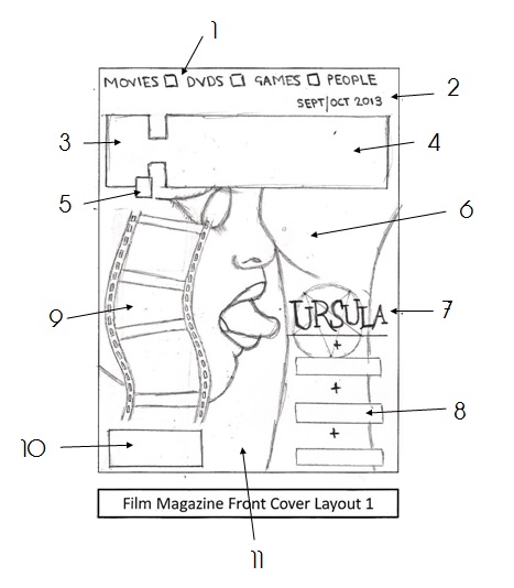
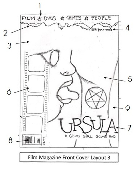
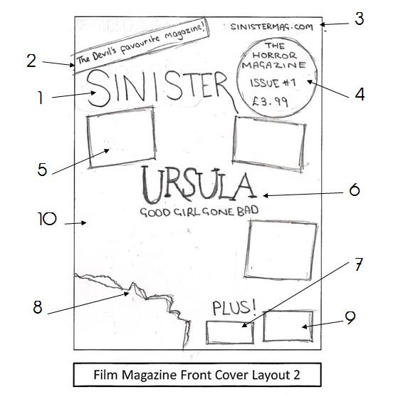
First Drafts (Magazine)
|
|
|
|
|
|
Photoshop Drafts (Magazine)
|
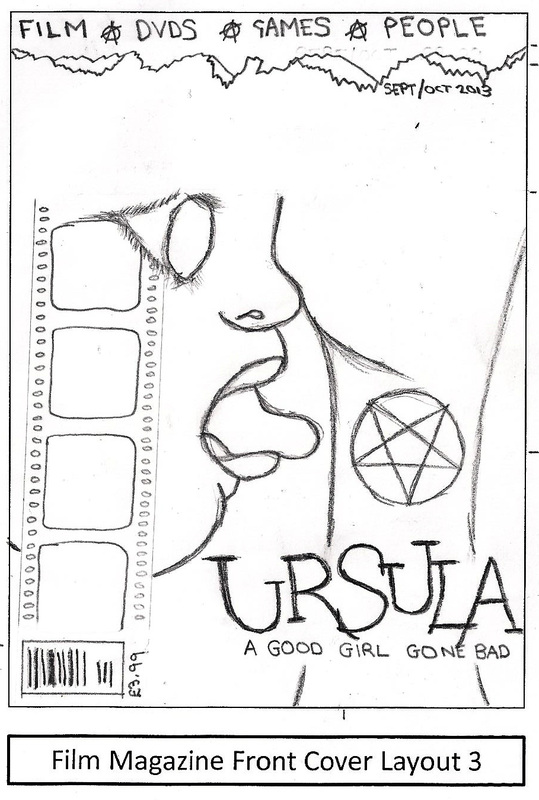
This is a Photoshop development of Film Magazine Front Cover Layout 3. In terms of placement, things pretty much stayed the same as they did when we first drew it out except the film strip has now straighten as opposed to being slightly slanted. Also the price has moved from being outside of the bar code to fitting in that space with the bar code.
|
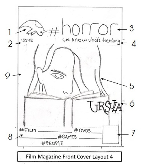
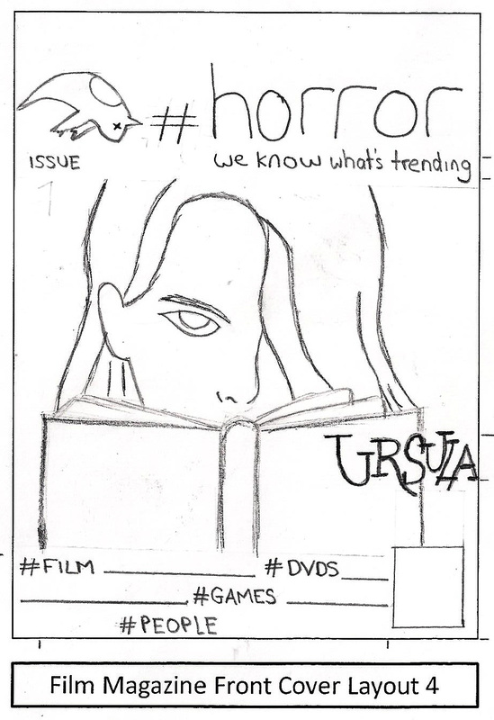
This is a Photoshop development of Film Magazine Front Cover Layout 4. The placement of things hasn't really changed much but using the Photoshop grid we have made a few adjustments. The bar code and price are now slightly lower than the cover lines whilst the Issue # is now overlaying the masthead.
|
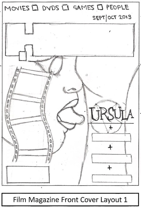
This is another Photoshop development of Film Magazine Front Cover Layout 3. Once again we've generally decided to keep the placement of things the same as the original drawing but as well as the film strip, this time we have also changed the main image. It will now be the one that was drawn on Film Magazine Front Cover Layout 4.
|
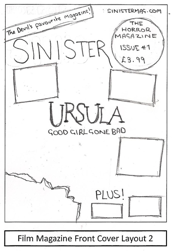
This is a Photoshop development draft of Film Magazine Front Cover Layout 2. The only real changes we made in terms of placement was the selling line which we rotated a big more, the 'Image Cover lines' which have now been straightened and also the bar code which has been made smaller to match the height of the cover lines beside it.
|
This is another Photoshop draft we made after doing more research into existing magazine front covers. The layout is heavily influenced by an issue of Total Film that featured Emma Watson on the cover promoting 'Harry Potter 7'. It wasn't a conventional horror magazine but the layout was great.
|

Existing Horror Film Posters
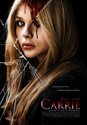
In terms of existing horror films, Carrie is probably the most similar to our own so it's no surprise we are looking to their poster for an influence for ours. We really like what is being done in the image with the blood to almost portray the split personality of good and evil. The shot itself of the girl is one was also like and have contemplated replicating it on our film poster.
|
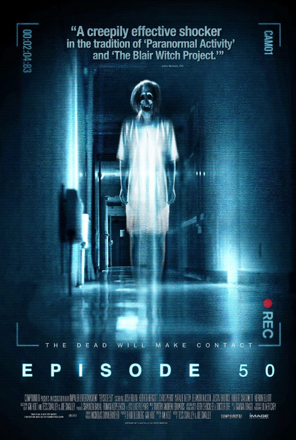
The only thing we really liked about this film poster was the location. We thought it would be nice if we were able to have an image of a subject standing in an empty hallway that appears to go on forever.
|
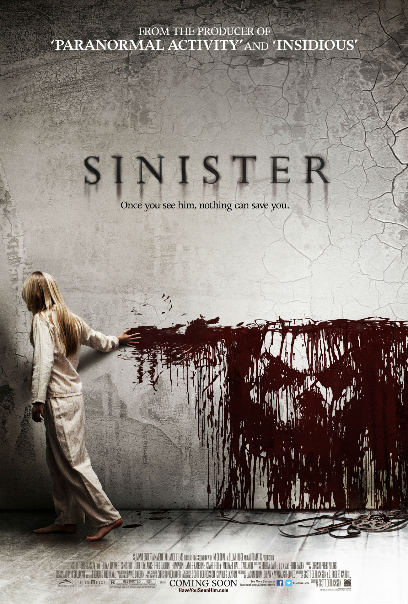
What we really liked about this poster was the effect that placed the demons face within the blood on the wall. The demon is quite an iconic figure in the film and particularly as we have attempted to include some sort of icons of our own, we thought it'd be very effective if we could style it in a similar way to this poster.
|
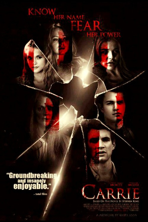
Another Carrie poster but this time it was the shattered glass effect that really caught our eye. We thought it'd be a good idea to place our own characters in a similar way to the poster above although we weren't quite sure if we could replicate such effects on Photoshop.
|
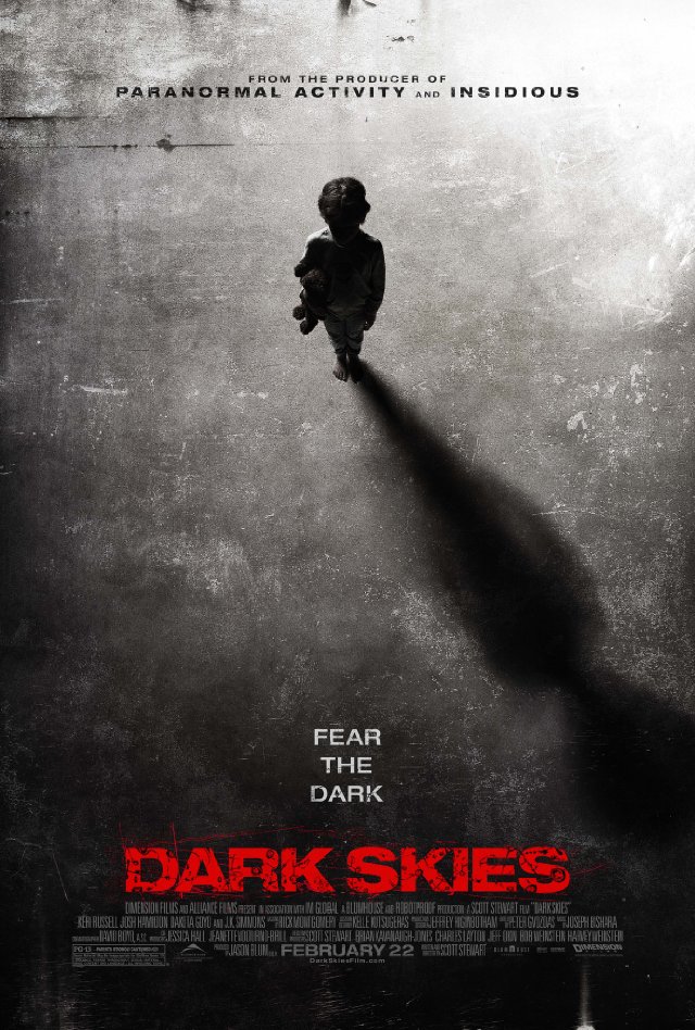
We liked particularly how this film poster portrayed isolation and lonely. The colour scheme was also noted as a possible influence for our own film poster.
|
First Drafts (Poster)
|
|
|
|
|
|
Photoshop Drafts (Poster)
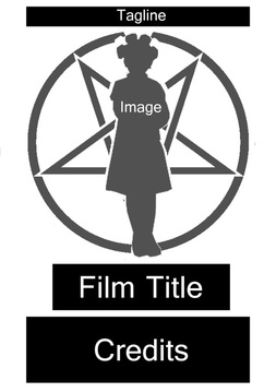
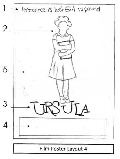
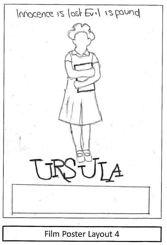
This is a Photoshop development of Film Poster Layout 4. The placement of the Tagline, Film Title and Credits stayed the same but the image was altered. Instead of having a girl photographed in a hallway as originally planned from the first draft drawing, she with now be standing with our iconic symbol etched behind her.
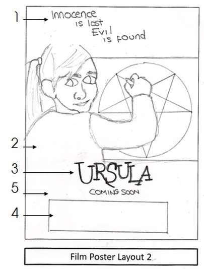
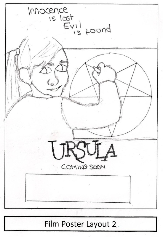
This is a Photoshop development of Film Poster Layout 2. The placements of everything including the Image remained unchanged although we decided to exclude the 'Coming Soon' that was in the original drawing. It may feature somewhere in the credits but probably not directly underneath the Film Title.
|
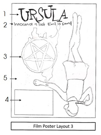
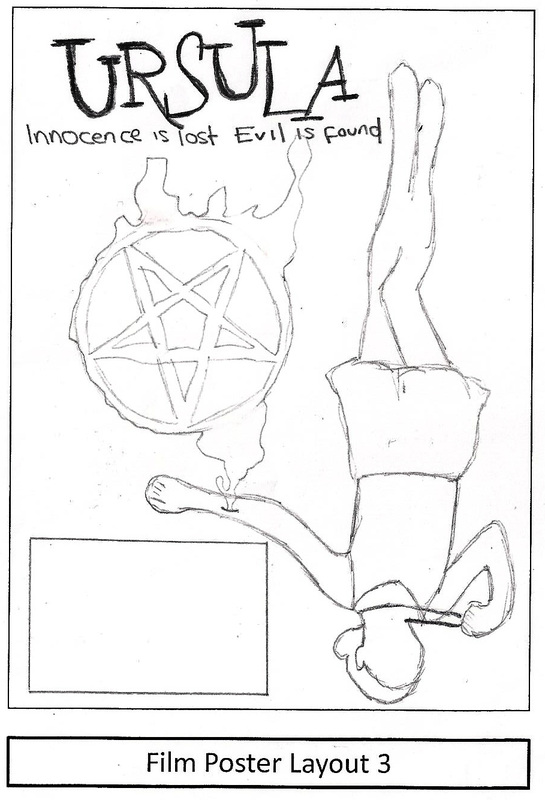
This a Photoshop development of our Film Poster Layout 3. We decided to keep the placements of the Tagline, Film Title and Credits the same although the Film Title increased in size from the original drawing. The only real change is the image now overlaps the Credits, Tagline and Title.
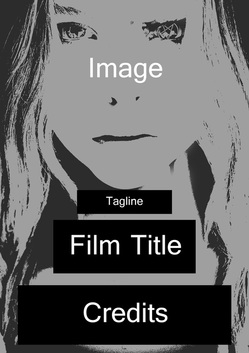
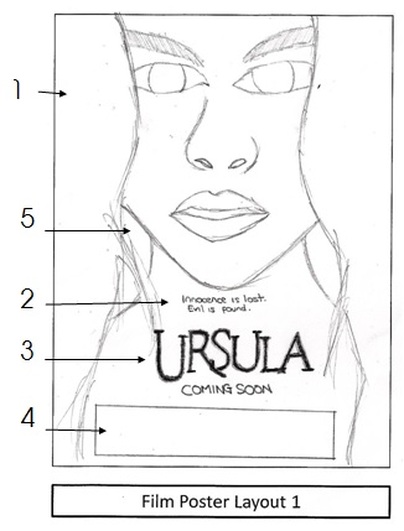
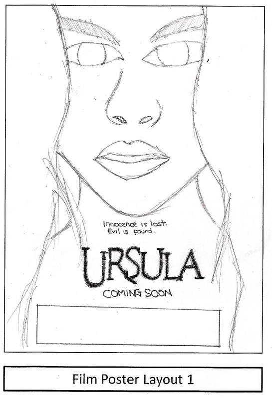
This is a Photoshop development of Film Poster Layout 1. The original drawing was firstly an image of a girl's face and just below her shoulders and the placement of the image remained unchanged. The size of the Tagline got bigger as well as the size of the space saved for Credits which also increased.
|
|
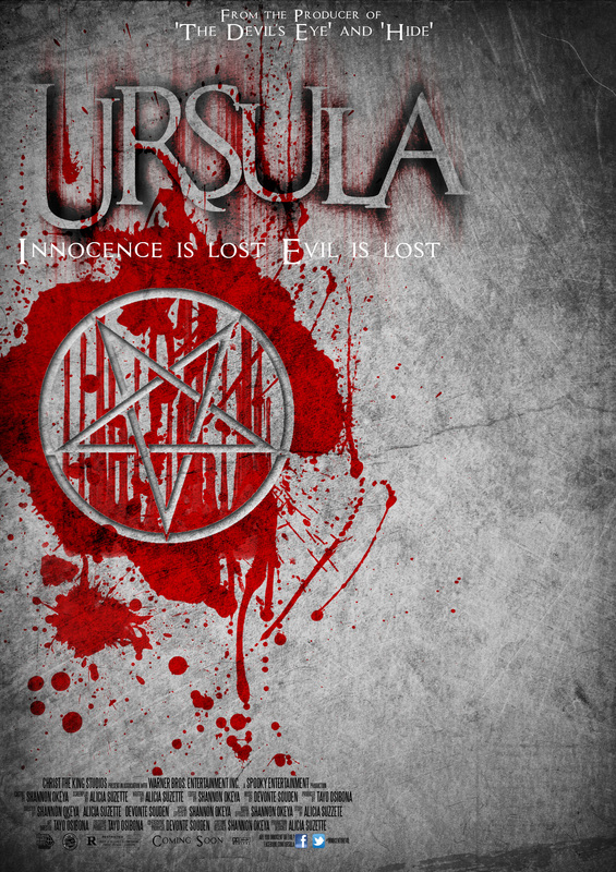
This Photoshop draft isn't a development of a previously drawn draft, but instead a development of group ideas. We liked the idea of our poster conveying the divide between innocence and evil and that is what's going on above. Our iconic star dripping in blood was influenced by the poster for the film Sinister.
|
This Photoshop draft is a result of group ideas. We collectively liked the idea of having a female subject holding up a mirror to her face and for her reflection to instead be of a possessed state or the demon who has possessed her.
|
As part of DRAFTING, as well as looking at existing products, drawing initial drafts and then transferring them onto Photoshop, we also took some test photos. The photos were taken in order to test the suitability of poses, lighting and also in order to give us a feel for the camera. In this instance it wasn't entirely important who was photographed as long as key elements of Mise en scène were experimented with and tested for future reference.
Draft Photos for Magazine and Film Poster
Following the completion of Pre-Production and having completed our DRAFTING and AUDIENCE RESEARCH, we have decided to keep a regular log of the development of our final products. The log will include updates on the progression surrounding our magazine and film poster as well as our thought process at the time of each update. Once it is done, the final products will be displaced for all to see on our home page.
1st Update
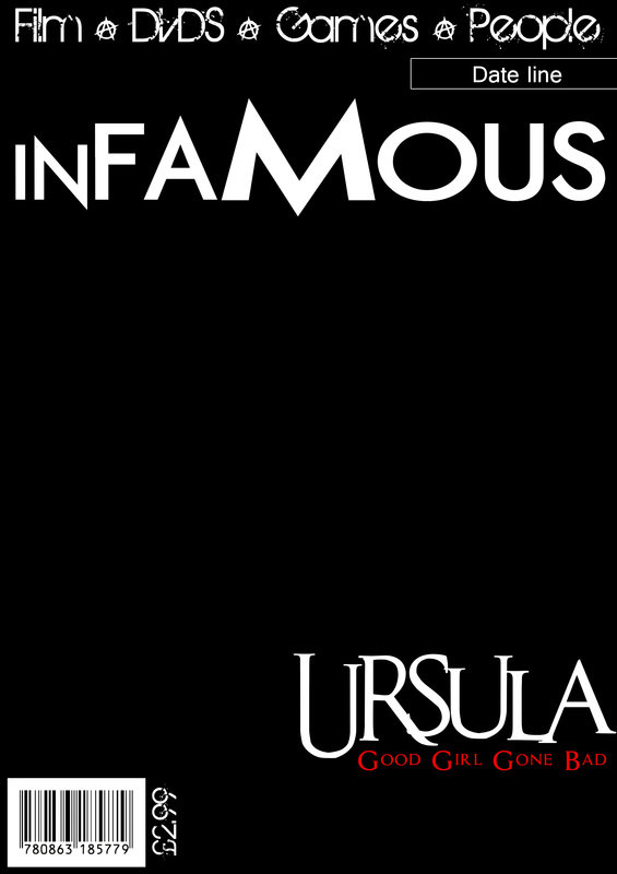
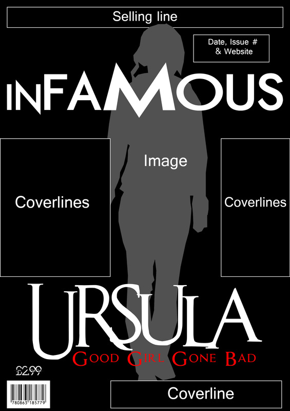
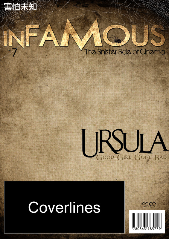
As our first venture into the production of our final products, we decided to take 3 of our magazine Photoshop drafts and begin to place the various bits and pieces that had already been decided during Pre-Production. At the time these included:
- Magazine Title
- Main Coverline
- Strap line
- Bar code
- Price
2nd Update
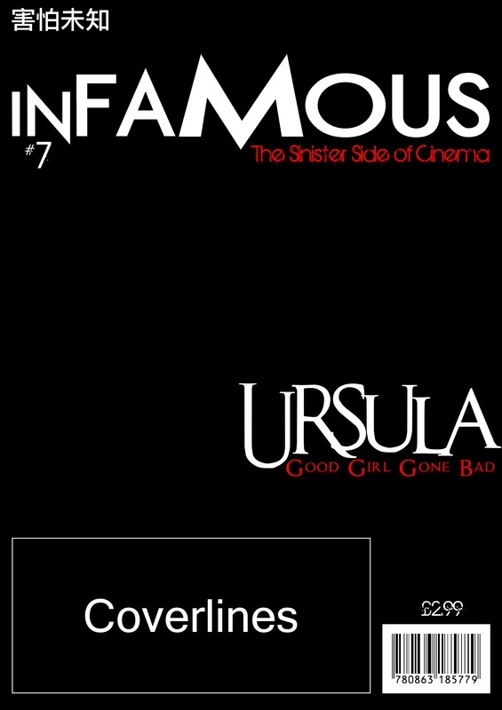
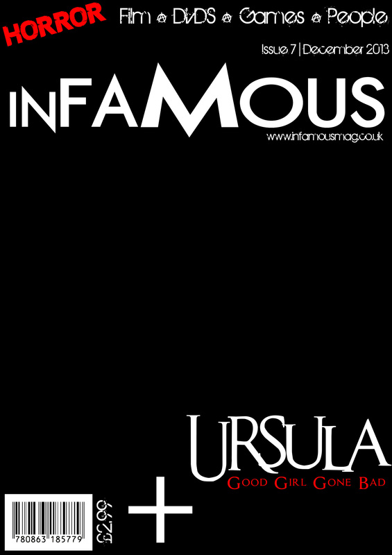
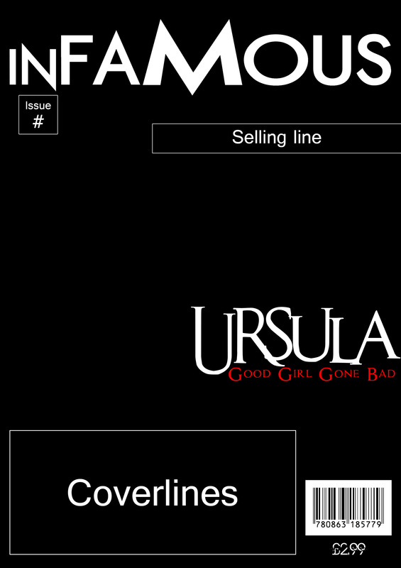
Following on from the 1st update, we continued to develop the 3 magazine final products and managed to add a lot more bits so that it was beginning to look more and more like a real media text. As we had not included all of the conventions yet the colour scheme stayed as the default colours we had used at the beginning but now the magazines began to feature:
- Issue #
- Date line
- Selling line
- Website line
3rd Update
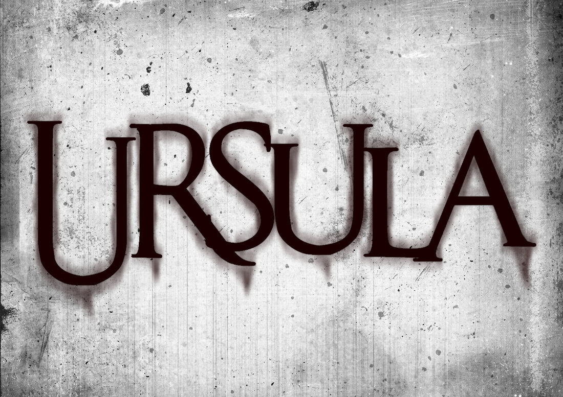
In between making 3 magazines and 3/4 poster as part of our final products we found time to test out a few things that could work well as a feature of any one of our final products. We decided to attempt to design our film title in a style similar to one of our inspiration existing films, Sinister. We were extremely pleased with the results of our experiment and feel as if it could play a part on one, if not all, of our final products.
4th Update
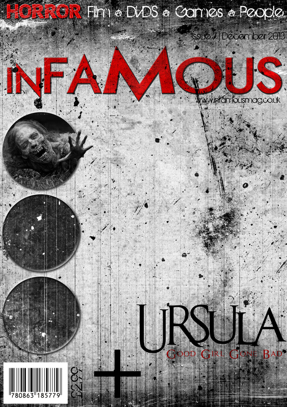
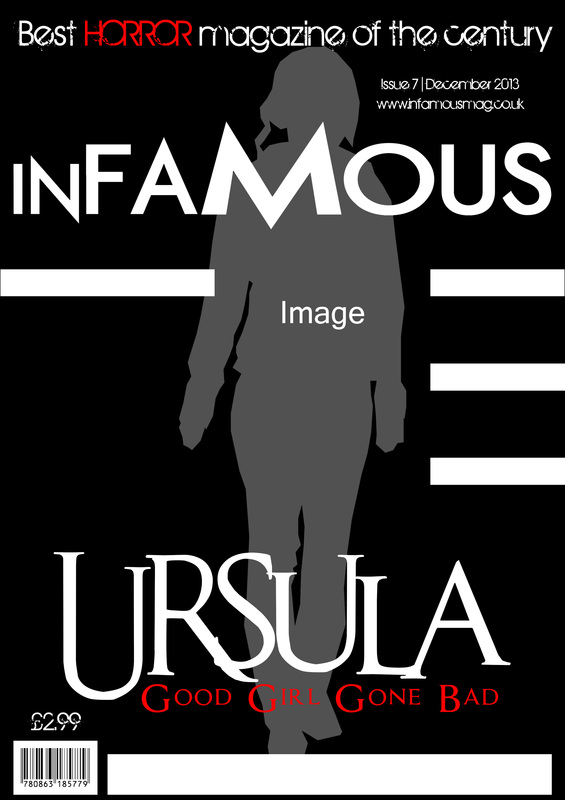
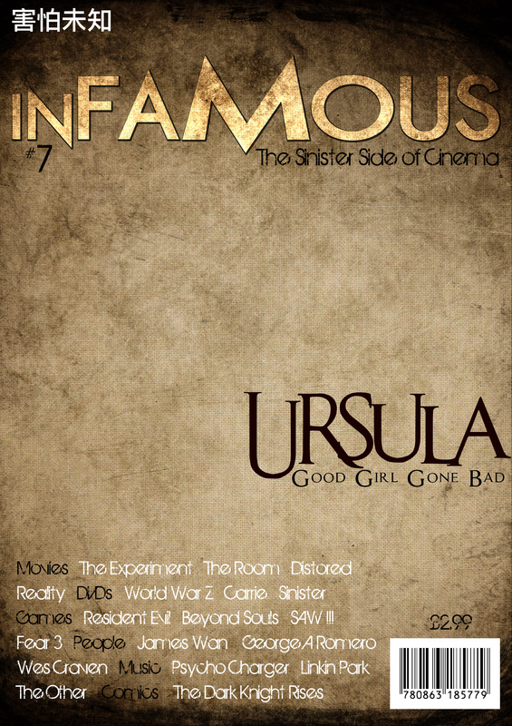
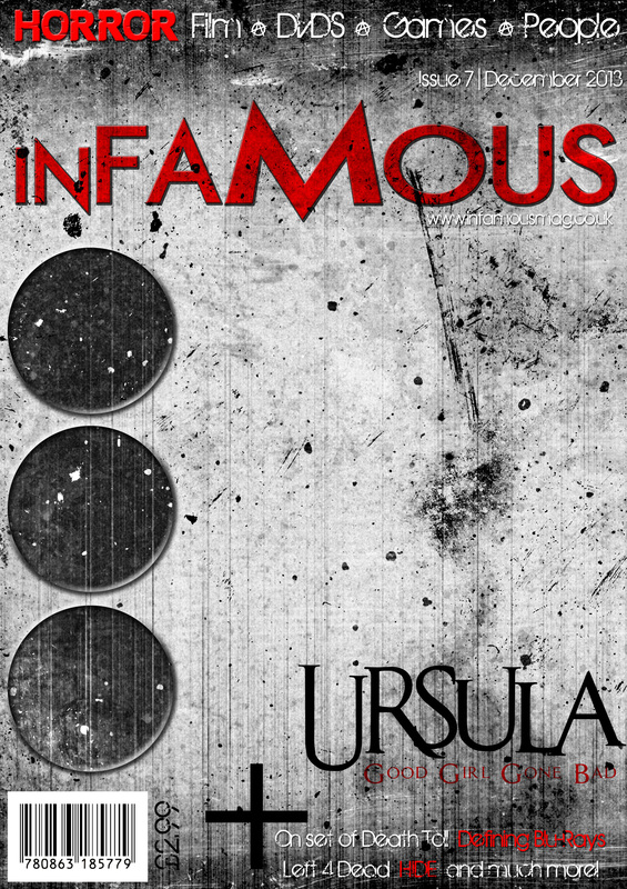
Despite the obvious omission of coverlines and images, the magazines look to be nearing completion, however these are just ideas that were created for the benefit of the group to reflect on. At this moment of time, the magazines are still at the stage we left them at during the 2nd Update but that's not to say that they'll not look like the developed images above. What's really important about this update is the introduction of a colour scheme. The idea surrounding our magazine is that it is almost a sort of "Special Edition" for our film, Ursula, so the colour scheme must reflect this. Apart from the addition of a colour scheme, of the the adaptations we included in these ideas was the change the originally planned film strip meant for the middle image into 3 circles that will feature images and then coverlines directly underneath, similar to the example.
5th Update
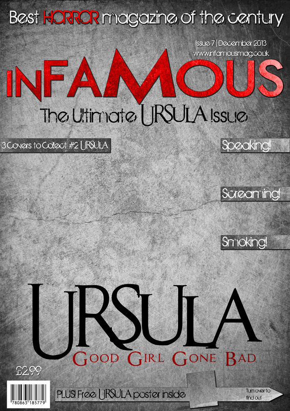
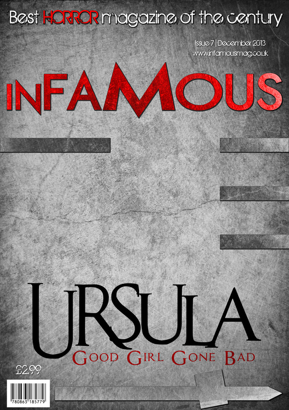
Continuing on from before, we decided to further develop our magazines with the ideas we had come up with previously. In this update all that's really changed is the addition of a few extra cover lines and perhaps a few font colour changes. Reflecting on it now, we can see that a few colours don't particularly blend well with their respective backgrounds and this is something we'll look to rectify in our next update. What's important about this stage is that, par any minor changes, we're nearly at a stage when all that is left is photography before our magazines will be completed.
As well as working on our magazine final products, we also made progress on our 3 film poster final products. In a similar way to what was done originally with our drafts, all we did was place each convention in its designated place. We also added things that we found to be present on films of a similar nature to our own. We're hoping to have the credits done on each film poster by the next update.
As well as working on our magazine final products, we also made progress on our 3 film poster final products. In a similar way to what was done originally with our drafts, all we did was place each convention in its designated place. We also added things that we found to be present on films of a similar nature to our own. We're hoping to have the credits done on each film poster by the next update.
6th Update
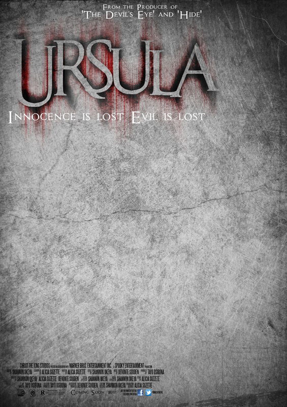
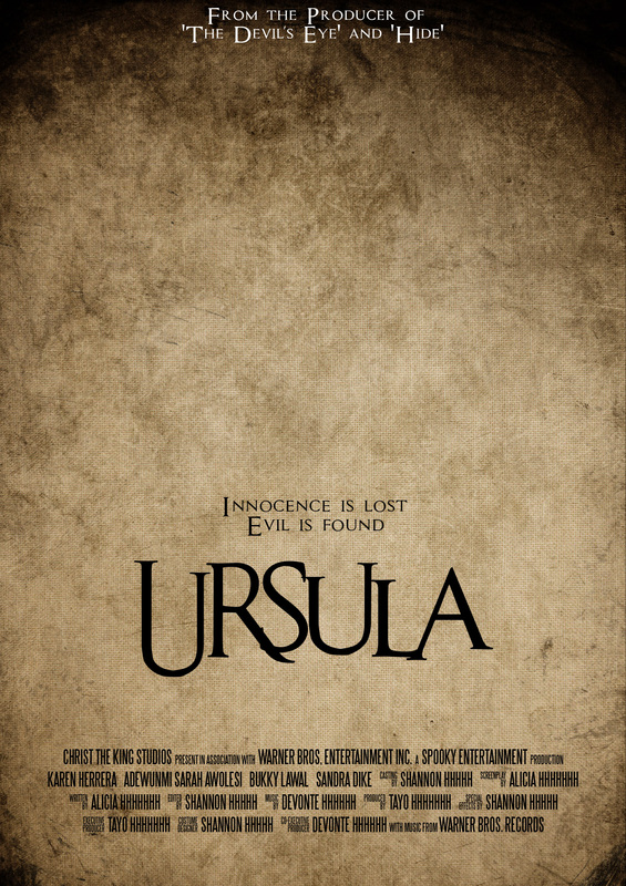
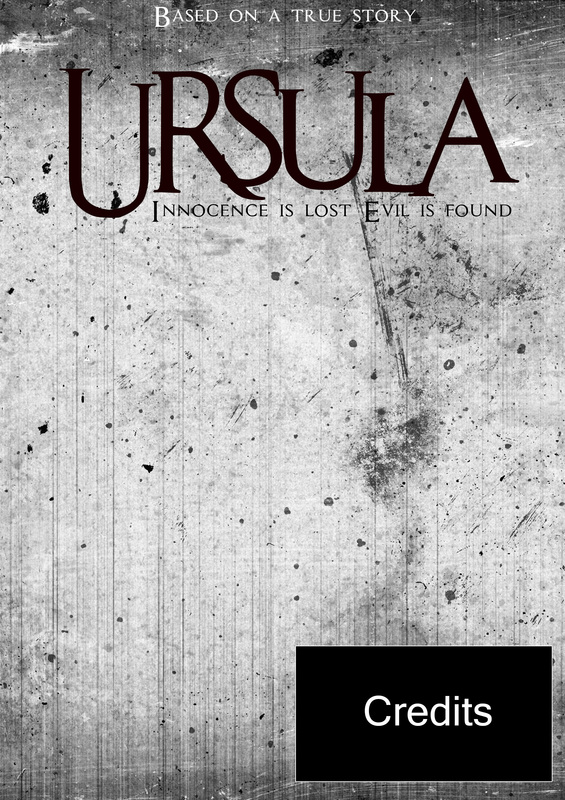
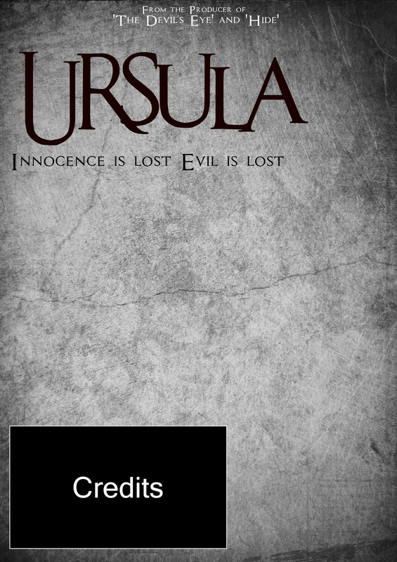
As we near the final deadline for our entire project, we decided to put our magazine final products aside for the time being and try to make more progress on our film poster final products. Although we were all in agreement that the film title, in combination with our chosen font, was extremely brand-able, we wanted to make it slightly more distinctive. We originally modelled the idea surrounding our film title look around the existing film Sinister but with a few adaptations it soon became our very own look. It would be a lie to say that this was the outcome we had expected from the beginning but it is an outcome we are very pleased with. Other small changes that were made include adding 'From the Producer of...' to each poster and also adding the final credits to all the posters. By the next update we hope to have all the posters completed with the exception of the main image.
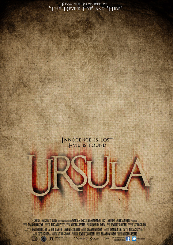
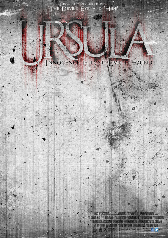
7th Update
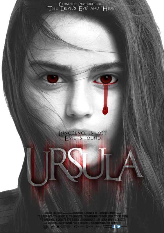
Having put the development of our film poster and magazine aside to focus on the filming of our trailer, not much progress was made since the 6th Update. With that being said, we did decide manage to work on one of our posters which is extremely close to completion (2nd Picture Above). The other picture above isn't exactly a development as the image isn't our own but instead its just an idea of what we may want our final poster to look like. We decided it'd be best to experiment with the the idea because it is very original and hadn't been done many times in the past with horror film posters. The overall outcome was pleasing and we think the colours worked well to connote the theme of our film which is 'Innocence vs Evil'.
