
Textual Analysis (Poster) - Tayo
Film Title: The Possession
Year of Release: 2012
Director: Ole Bornedal
Production/Financing Company: Ghost House Pictures, North Box Productions and Lionsgate
Principle Cast:
Films Origin/Info: Franchise
Synopsis: The Possession is about a young girl (Em) who buys a mysterious old box at a yard sale. What Em doesn’t know is that the box contains a demon, Abyzou, who is the “taker of children”. The film consists of the parents’ frantic fight to save their possessed daughter.
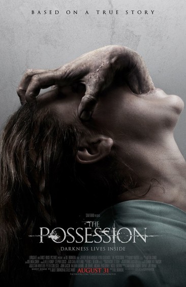
Conventions: The poster follows conventions of the horror genre particularly as the poster features a single subject which has connotations of isolation and being alone. The image itself is quite dark and doesn’t feature any bright colours which follow conventions of the horror genre. The fact that we can only see the girl and what appears to be the possessions hand looming from her mouth almost conveys that the possession has her all to herself.
Mood: The poster conveys a very grim mood. There is quite a disturbing image of a hand reaching out from within a girl’s mouth and attempting to grab her face which could be intended to evoke fear. This is one of the moods that the audiences will be in.
Font/Names: Featured on the top of the poster in bold letters are the words “Based on a true story” which immediately gets the audience thinking as they not only have a fear of the film but also a fear that what they are watching may have happened in real life at one point. The film poster doesn’t prominently feature the names of the actors and actresses involved in the film but what it does feature is the title of the film in bold letters ‘The Possession’. They have also put ‘August 31’ in red font at the bottom of the page which immediately stands out.
Credits: There are 3 different marketing posters for the film The Possession and all 3 feature the same synergy as the other. Each poster contains an explicit image of an event that occurs in the film and neither of the 3 prominently features the names of the actors and actresses on the poster. This could connote that the film stars used were not particular renowned and the director wanted the focus of the posters to be on the disturbing image and not the cast.
Colour: The poster contains a lot of dull and dark colouring in order to connote the genre of the film which is horror. Although it connotes the genre of horror it further conveys the sub-genre of Supernatural/Psychological especially since over sub-genres like Splatter often contains lots of colours on their posters to show blood and gore. The poster has used many black and grey colours usually these colours would connote darkness, awareness and fear of horror. The poster however does eventually contain a bright colour further down the bottom which is in bright red to connote blood and danger.
Tagline: The tagline for the film is ‘Darkness lives inside’ although you could argue that ‘Based on a true story’ is also the tagline for the film. They have chosen to feature the tagline in an attempt to almost tease the audience about the plot of the film because if they had seen the trailer they most likely would have seen a particularly disturbing shot of fingers poking out of a young girl’s mouth.
Quotes: Often movie posters will feature quotes from reviewers and critics displaying the amount of stars they had received and also what was said about the film however this isn’t often the case for horror films. The possession doesn’t feature any quotes on its poster.
Year of Release: 2012
Director: Ole Bornedal
Production/Financing Company: Ghost House Pictures, North Box Productions and Lionsgate
Principle Cast:
- Natasha Calis
- Jeffrey Dean Morgan
- Kyra Sedgwick
- Matisyahu
Films Origin/Info: Franchise
Synopsis: The Possession is about a young girl (Em) who buys a mysterious old box at a yard sale. What Em doesn’t know is that the box contains a demon, Abyzou, who is the “taker of children”. The film consists of the parents’ frantic fight to save their possessed daughter.
Conventions: The poster follows conventions of the horror genre particularly as the poster features a single subject which has connotations of isolation and being alone. The image itself is quite dark and doesn’t feature any bright colours which follow conventions of the horror genre. The fact that we can only see the girl and what appears to be the possessions hand looming from her mouth almost conveys that the possession has her all to herself.
Mood: The poster conveys a very grim mood. There is quite a disturbing image of a hand reaching out from within a girl’s mouth and attempting to grab her face which could be intended to evoke fear. This is one of the moods that the audiences will be in.
Font/Names: Featured on the top of the poster in bold letters are the words “Based on a true story” which immediately gets the audience thinking as they not only have a fear of the film but also a fear that what they are watching may have happened in real life at one point. The film poster doesn’t prominently feature the names of the actors and actresses involved in the film but what it does feature is the title of the film in bold letters ‘The Possession’. They have also put ‘August 31’ in red font at the bottom of the page which immediately stands out.
Credits: There are 3 different marketing posters for the film The Possession and all 3 feature the same synergy as the other. Each poster contains an explicit image of an event that occurs in the film and neither of the 3 prominently features the names of the actors and actresses on the poster. This could connote that the film stars used were not particular renowned and the director wanted the focus of the posters to be on the disturbing image and not the cast.
Colour: The poster contains a lot of dull and dark colouring in order to connote the genre of the film which is horror. Although it connotes the genre of horror it further conveys the sub-genre of Supernatural/Psychological especially since over sub-genres like Splatter often contains lots of colours on their posters to show blood and gore. The poster has used many black and grey colours usually these colours would connote darkness, awareness and fear of horror. The poster however does eventually contain a bright colour further down the bottom which is in bright red to connote blood and danger.
Tagline: The tagline for the film is ‘Darkness lives inside’ although you could argue that ‘Based on a true story’ is also the tagline for the film. They have chosen to feature the tagline in an attempt to almost tease the audience about the plot of the film because if they had seen the trailer they most likely would have seen a particularly disturbing shot of fingers poking out of a young girl’s mouth.
Quotes: Often movie posters will feature quotes from reviewers and critics displaying the amount of stars they had received and also what was said about the film however this isn’t often the case for horror films. The possession doesn’t feature any quotes on its poster.
Textual Analysis (Poster) - Devonte
Title- Texas Chainsaw 3D
Director- John Luessenhop
Year of release- January 4th
Production/Financing company- Main Line pictures
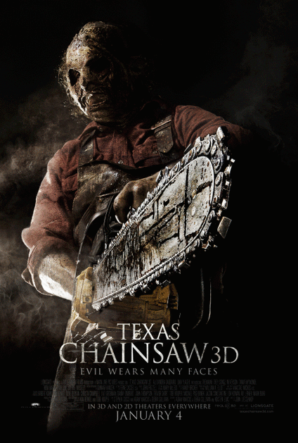
Mise-en- scene: Lighting- The lighting of the post is dark which create this scary and unknown effect.
NVC- As you look at the main image you can see the serious, aggressive look in his face. Also he is looking directly at the camera which can connate that his a very aggressive man.
Setting- The setting of the picture looks like it in a studio, however have altered the background on computer.
Costumes- The person in the main image appears to be wearing an old dirty mask, a burgundy shirt and an old used all in one jumpsuit. The mask is a common convention of slasher which are used to cover the identity of the person
Props- The person in the picture is holding a rusty chainsaw, therefore this can connate that he uses the chainsaw to kill people with base on how he is holding the chainsaw
Camera Angles- The image of the photo appear to be taken from a low angles which connate and makes him look like he’s inferior
Focus- The focus is a depth of field which show the Antagonist
Colour- The colour of the picture appear to be dark which create an scary, unknown effect on the audience because you can’t see what behind
Conventions- Due to the film poster being a slasher it follow the conventions of masks and weapon which is a dark colour which is one of the conventions a film poster has. Also it displays the Title of the movie and quotes under the image which one of the main convention that any film poster has. Another convention it contains is the credits and the release which is seen on every film poster.
Moods- As the genre of this is horror and the sub-genre is slasher. This poster mood is angry and aggressive which usually follow the conventions of other slasher poster that main used angry or muscular men which emphasis the aggressive in the poster
Font/Names- The title of the poster “Texas Chainsaw 3D” is present in a bold white colour but also fade into the dark background. Below the tile “Evil Wears many faces” which is present in a small size which the same colour of white however fades into the dark background even more which connate that a lot of thing in the film are hidden.
Credits- The credits in the poster are written in a very small size which follow the conventions that a normal film poster would have. In the credits the production team, director and stars in the film are reveal which connotes that most of the stars are well known and will attract a wider audience
Colour- This move poster is in a dark black background however uses a bit of fade which fade into grey and making the text/pictures this connate that some things in the poster are meant to be hide which give it a more scary effect
Quotes- The quote in this poster is Evil wears many faces which connate that there are a lot of evil people in the film
NVC- Angry, Aggressive
Camera- The camera shot is taken from a long angle which makes the male muscular character looks more dominated and scary and creates an inferior effect.
Main Image- A sweaty strong muscular man holding an old rusty chain saw in old clothing and wearing a mask to cover his identity and directly making eye contact into the camera
Director- John Luessenhop
Year of release- January 4th
Production/Financing company- Main Line pictures
Mise-en- scene: Lighting- The lighting of the post is dark which create this scary and unknown effect.
NVC- As you look at the main image you can see the serious, aggressive look in his face. Also he is looking directly at the camera which can connate that his a very aggressive man.
Setting- The setting of the picture looks like it in a studio, however have altered the background on computer.
Costumes- The person in the main image appears to be wearing an old dirty mask, a burgundy shirt and an old used all in one jumpsuit. The mask is a common convention of slasher which are used to cover the identity of the person
Props- The person in the picture is holding a rusty chainsaw, therefore this can connate that he uses the chainsaw to kill people with base on how he is holding the chainsaw
Camera Angles- The image of the photo appear to be taken from a low angles which connate and makes him look like he’s inferior
Focus- The focus is a depth of field which show the Antagonist
Colour- The colour of the picture appear to be dark which create an scary, unknown effect on the audience because you can’t see what behind
Conventions- Due to the film poster being a slasher it follow the conventions of masks and weapon which is a dark colour which is one of the conventions a film poster has. Also it displays the Title of the movie and quotes under the image which one of the main convention that any film poster has. Another convention it contains is the credits and the release which is seen on every film poster.
Moods- As the genre of this is horror and the sub-genre is slasher. This poster mood is angry and aggressive which usually follow the conventions of other slasher poster that main used angry or muscular men which emphasis the aggressive in the poster
Font/Names- The title of the poster “Texas Chainsaw 3D” is present in a bold white colour but also fade into the dark background. Below the tile “Evil Wears many faces” which is present in a small size which the same colour of white however fades into the dark background even more which connate that a lot of thing in the film are hidden.
Credits- The credits in the poster are written in a very small size which follow the conventions that a normal film poster would have. In the credits the production team, director and stars in the film are reveal which connotes that most of the stars are well known and will attract a wider audience
Colour- This move poster is in a dark black background however uses a bit of fade which fade into grey and making the text/pictures this connate that some things in the poster are meant to be hide which give it a more scary effect
Quotes- The quote in this poster is Evil wears many faces which connate that there are a lot of evil people in the film
NVC- Angry, Aggressive
Camera- The camera shot is taken from a long angle which makes the male muscular character looks more dominated and scary and creates an inferior effect.
Main Image- A sweaty strong muscular man holding an old rusty chain saw in old clothing and wearing a mask to cover his identity and directly making eye contact into the camera
Textual Analysis (Poster) - Alicia
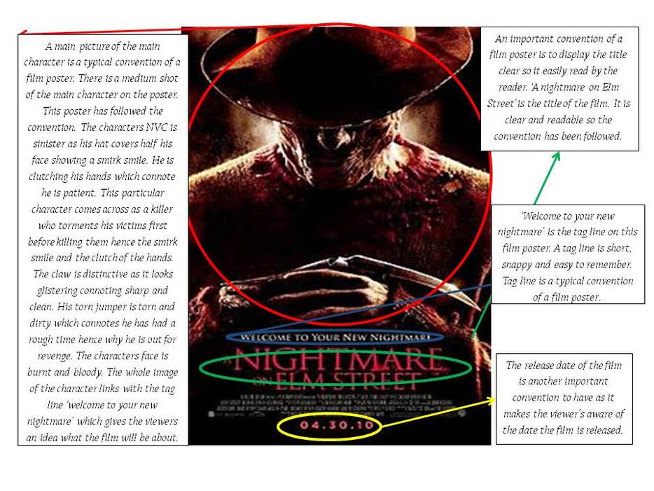
Film Title: A Nightmare on Elm Street
Release Date: 30th April 2010
Director: Samuel Bayer
Production Company: Platinum Dunes which is an American production company that specialise in horror films
Principle Cast:
Films Origin: It is a remake of the original a nightmare on Elm Street which was released on the 4th November 1984 by Wes Craven.
Synopsis: Nancy and Quentin steal some adreline and a syringe to prevent them from sleeping and being killed in their sleep by Freedy Krueger; who has killed most of their friends. They believe Krueger wants revenge for being burnt alive because he was abusing children. The only way to put an end to this is to pull him out of their dream and kill him in reality.
Mood: Due to the low key lighting the poster conveys a dangerous and gloomy mood.
Font: ‘A nightmare on Elm Street’ is the title of the film and it is placed underneath the picture centred in a red serif font. The red connotes blood which relates to the sub-genre of the film. The tag-line is in a white serif font placed on top of the title on a dark bloody background. The serif font connotes old fashion which links with the fact this film is a remake.
Credits: the credits are placed at the bottom of the poster and it includes the director’s name, production Company and cast. The font is tiny is squashed which is the typical convention.
Colour: The purpose of a film poster is to advertise and inform viewers about an upcoming film hence the need for good colour scheme throughout and a clear image. The poster above has successfully attracted viewers due to the low key lightning and a dark colour scheme. The low key lightning connotes danger, violence and mystery which relate to the film genre of thriller. Red and black is the intense colour scheme used to build suspense. The red connotes blood which links to the sub-genre of this film which is slasher. The black on the other hand connotes mystery. Both colours used for this poster emphasis on the link to the thriller film genre.
Quote: NO QUOTES
Release Date: 30th April 2010
Director: Samuel Bayer
Production Company: Platinum Dunes which is an American production company that specialise in horror films
Principle Cast:
- Jackie Earle Haley
- Kyle Gallner
- Rooney Mara
- Katie Cassidy
- Thomas Dekker
- Kellan Lutz
- Steve Jablonsky
Films Origin: It is a remake of the original a nightmare on Elm Street which was released on the 4th November 1984 by Wes Craven.
Synopsis: Nancy and Quentin steal some adreline and a syringe to prevent them from sleeping and being killed in their sleep by Freedy Krueger; who has killed most of their friends. They believe Krueger wants revenge for being burnt alive because he was abusing children. The only way to put an end to this is to pull him out of their dream and kill him in reality.
Mood: Due to the low key lighting the poster conveys a dangerous and gloomy mood.
Font: ‘A nightmare on Elm Street’ is the title of the film and it is placed underneath the picture centred in a red serif font. The red connotes blood which relates to the sub-genre of the film. The tag-line is in a white serif font placed on top of the title on a dark bloody background. The serif font connotes old fashion which links with the fact this film is a remake.
Credits: the credits are placed at the bottom of the poster and it includes the director’s name, production Company and cast. The font is tiny is squashed which is the typical convention.
Colour: The purpose of a film poster is to advertise and inform viewers about an upcoming film hence the need for good colour scheme throughout and a clear image. The poster above has successfully attracted viewers due to the low key lightning and a dark colour scheme. The low key lightning connotes danger, violence and mystery which relate to the film genre of thriller. Red and black is the intense colour scheme used to build suspense. The red connotes blood which links to the sub-genre of this film which is slasher. The black on the other hand connotes mystery. Both colours used for this poster emphasis on the link to the thriller film genre.
Quote: NO QUOTES
Textual Analysis (Poster) - Shannon
Film Title: Paranormal Activity
Release Date: 16th October 2009
Director: Sam Oreli
Production Company: Solana Films, Blumhouse Productions
Principle Cast:
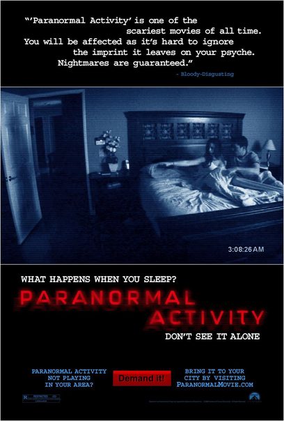
The image used in this poster introduces the two main characters and the setting. The picture is a snapshot of actual footage within the film. This is clever, as it gives the viewer a small insight of what is happening, therefore inclining the viewer towards the film. The poster is very basic, but clever as it shows how some terrifying things can happen to common people. The way that the poster is set out with the large image of the couple in bed makes the dark figure what you notice straight away. The characters seem young which connotes that young people are the target audience. An ordinary house as a setting is a common horror location as you see everyday life then up comes a shambles . Bedrooms are usually associated with comfort however in this case the dark figure against the door creates terror and fear which can also be seen in the nvc of the two young characters. the image seems like what has been filmed, perhaps a cctv camera also the time at corner connotes this too.The image is a scary and mysterious, with the night-vision/ de-saturated effect is tactically being used to ensure the image fits in with the style of the poster, and ultimately the poster within the genre of film. The image also poses the question of what the couple are scared of and what exactly is that figure which it’s not directly obvious, which makes people want to find out the answer to those questions.
The colours used in this poster are black, white, red and blue and each of these can be associated with the horror genre. Firstly, black is a typical convention of the horror genre as its associated with death and the unknown, The white text against the black background creates a cold and ghostly feeling. The red for connotes danger and blood. Finally, the blue colours connotes a cold and chilling atmosphere which is associated ghosts.
Text: The title is larger and different coloured to the rest of the poster enabling the film title to stand out and its blurriness also conotes that the film is based on video footage. Most of the text on this poster is in capitals making it intimidating. The title “Paranormal Activity” is positioned just underneath the image, which another important noticeable thing about the poster, people will have to have a look round the poster to find out everything on the poster, increasing the success and awareness of the film. The font that the title is written in heavily portrays the themes of blood and danger in my opinion, so the title definitely fits in with the genre of the film.
Language: The slogan “what happens when you sleep” directly addresses the audience which triggers thoughts as no one really knows what happens as we sleep, which makes the audience want to watch it more as they want to find out what happens to the characters, Similarly, “Don’t watch it alone,” tells the audience to brace their self and also not to watch it alone, of course people will go to cinemas in groups, rather than a few individual people which increases the ticket sales, they used some sort of reverse psychology, because they have warned you not to go alone, why would you go alone ?. The positive film review on the poster suggests that this film is a success.. Furthermore, by suggesting that “you will be affected” the film is challenging the audience to see whether attending the film will psychologically affect them and “guaranteed” suggests that the film will meet the consumer’s high standards.
Layout: The layout is fairly simple but attention is drawn to the main image in the centre. The simplistic nature of poster is clever again because it shows the audience that no special effects have been used, again highlighting the fact that this can happen to normal people.The organization of the text is structured; the audience’s eye follows the positioned flow. Firstly, the mysterious figure at the door creates an enigma as it is ambiguous to the audience who or why this figure is there. Then, the language used, “what happens when you sleep?” causes audience to question it mentally. Using a review in this poster reflects how this film is good enough to gain critic attention. And the quote at the top at the poster, states how scary the film is by the use of phrases such as “Nightmares are guaranteed” and “one of the scariest films of all time”, so instead of people just thinking their own, they get a second opinion.
Advertising: The Paranormal Activity poster offers a demand service that encourages potential audiences to get the film playing at a cinema in their area if its already not. This is because the film was a low budget horror meaning that it was not shown in all cinemas. By doing this, its easier for the producers to see how successful the film will be as they can see who and where their audiences are.
Release Date: 16th October 2009
Director: Sam Oreli
Production Company: Solana Films, Blumhouse Productions
Principle Cast:
- Katie Featherston
- Micah Sloat
- Mark Fredrichs
- Amber Armstrong
- Ashley Palmer
The image used in this poster introduces the two main characters and the setting. The picture is a snapshot of actual footage within the film. This is clever, as it gives the viewer a small insight of what is happening, therefore inclining the viewer towards the film. The poster is very basic, but clever as it shows how some terrifying things can happen to common people. The way that the poster is set out with the large image of the couple in bed makes the dark figure what you notice straight away. The characters seem young which connotes that young people are the target audience. An ordinary house as a setting is a common horror location as you see everyday life then up comes a shambles . Bedrooms are usually associated with comfort however in this case the dark figure against the door creates terror and fear which can also be seen in the nvc of the two young characters. the image seems like what has been filmed, perhaps a cctv camera also the time at corner connotes this too.The image is a scary and mysterious, with the night-vision/ de-saturated effect is tactically being used to ensure the image fits in with the style of the poster, and ultimately the poster within the genre of film. The image also poses the question of what the couple are scared of and what exactly is that figure which it’s not directly obvious, which makes people want to find out the answer to those questions.
The colours used in this poster are black, white, red and blue and each of these can be associated with the horror genre. Firstly, black is a typical convention of the horror genre as its associated with death and the unknown, The white text against the black background creates a cold and ghostly feeling. The red for connotes danger and blood. Finally, the blue colours connotes a cold and chilling atmosphere which is associated ghosts.
Text: The title is larger and different coloured to the rest of the poster enabling the film title to stand out and its blurriness also conotes that the film is based on video footage. Most of the text on this poster is in capitals making it intimidating. The title “Paranormal Activity” is positioned just underneath the image, which another important noticeable thing about the poster, people will have to have a look round the poster to find out everything on the poster, increasing the success and awareness of the film. The font that the title is written in heavily portrays the themes of blood and danger in my opinion, so the title definitely fits in with the genre of the film.
Language: The slogan “what happens when you sleep” directly addresses the audience which triggers thoughts as no one really knows what happens as we sleep, which makes the audience want to watch it more as they want to find out what happens to the characters, Similarly, “Don’t watch it alone,” tells the audience to brace their self and also not to watch it alone, of course people will go to cinemas in groups, rather than a few individual people which increases the ticket sales, they used some sort of reverse psychology, because they have warned you not to go alone, why would you go alone ?. The positive film review on the poster suggests that this film is a success.. Furthermore, by suggesting that “you will be affected” the film is challenging the audience to see whether attending the film will psychologically affect them and “guaranteed” suggests that the film will meet the consumer’s high standards.
Layout: The layout is fairly simple but attention is drawn to the main image in the centre. The simplistic nature of poster is clever again because it shows the audience that no special effects have been used, again highlighting the fact that this can happen to normal people.The organization of the text is structured; the audience’s eye follows the positioned flow. Firstly, the mysterious figure at the door creates an enigma as it is ambiguous to the audience who or why this figure is there. Then, the language used, “what happens when you sleep?” causes audience to question it mentally. Using a review in this poster reflects how this film is good enough to gain critic attention. And the quote at the top at the poster, states how scary the film is by the use of phrases such as “Nightmares are guaranteed” and “one of the scariest films of all time”, so instead of people just thinking their own, they get a second opinion.
Advertising: The Paranormal Activity poster offers a demand service that encourages potential audiences to get the film playing at a cinema in their area if its already not. This is because the film was a low budget horror meaning that it was not shown in all cinemas. By doing this, its easier for the producers to see how successful the film will be as they can see who and where their audiences are.
