
Textual Analysis (Magazine) - Tayo
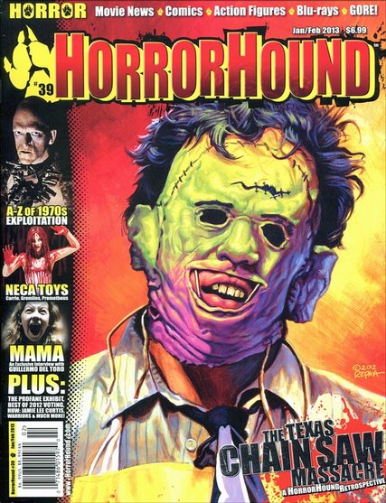
Masthead (Logo): The HORRORHOUND masthead is the same used throughout all of their HORRORHOUND magazines. The masthead is always in Sans Serif font as there are no flick ups present and it is strict, bold letters. Using Sans Serif font often connotes a modern feel and that is the case with this masthead. The red, gradient masthead helps to convey blood which is ever present in horror films. The paw print that is on the left hand side of the masthead is the same on all of their magazines although the colour varies.
Dateline: The month and year of publication of the magazine is present in top right hand side of the magazine, just about the masthead, along with the price of the magazine. In this case the magazine features two months “Jan/Feb” although it is common that a monthly magazine usually goes on sale the month before the cover date.
Main Image: On the front cover of the Issue #39 HORRORHOUND there is a single image of the iconic horror character ‘Leatherface’ who is a recognisable face amongst all horror film fans. The image is a medium close up shot as we are able to see just below his shoulders. Although the picture is of a horror character it appears to be posterized, as if it was drawn and not photographed. The character is making direct eye contact although the eyes are not visible. The colours used in the image make it stand out.
Model Credit/ Main Coverline: The main coverline on the magazine reads “The Texas Chainsaw Massacre” This makes reference to the release of the remake ‘Texas Chainsaw 3D’ which was released on January 4th 2013, the same month of publication. The photographer and model of the image are often on the contents page although there is a copyright signature that also reads “2012 Repka”.
Coverlines: HORRORHOUND magazine doesn’t use a lot of coverlines and instead uses a lot of images, all of which are distributed around the main image without detracting from it at all. The images do have coverlines under them but the coverlines rarely say much. There is also a coverline strip at the very top of the magazine which displays what may feature in the rest of the magazine.
Left Third: The left third of the magazine cover consists of mini images that feature other horror films such as ‘Carrie’ and ‘Mama’. These aren’t the same films featured on HORRORHOUND’s entire magazine range as the pictures do vary between issues. It is important for the left third to visual for when the magazine is being sold in shops and isn’t shown full-frontage. On the left third of the magazine you’d be able to see the word ‘Horror’ and that very top with would immediately alert you to the magazines content and then the paw print just underneath that’d let you know the magazine is HORRORHOUND. It is also vital the coverlines seen are short and easy to read which happens to be the case of this magazine.
Barcode: Standard barcode located at the bottom left hand side of the magazine.
Selling line: There doesn’t appear to be a clear selling line for the HORRORHOUND magazine.
Textual Analysis (Magazine) - Devonte
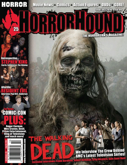
Title-HorrorHound
Lighting- There is a low key lighting ( dark black) colours which is usually display in most horror films.
NVC- The facial expression of the character is quite serious and looks scared, also the zombie is looking directly into the camera which emphasis the power the zombie has as it shows no fear.
Setting- The setting of the photo look like it’s in a studio and they have use light and dark colours of grey and black in the background which makes the face of the zombie more visible.
Costumes- The costume of the horror character looks very scary and ugly to the eye which is usually display in a horror magazine and makes the magazine look scarier. The costume looks like it might have been computer generate or a one piece costume
Props- No props were used
Camera angle/Shot size- The camera angle is taken at a mid-angle which display the head to the shoulder, however the image has been taken which turns the image into a mid-shot.
Colours- The colour of the magazine is dark grey and dark black which is normally the colours a horror magazine have, therefore this gives it a spooky effect.
Main image- The main image is a picture of a female zombie which is a mid-shot and the background are dark grey and black which connote darkness in the picture
Master-head- The Master-head of the magazine is called "HorrorHound". The colour of the master-head is black inside the text and a red boarder around it, this therefore connote darkness and blood. Also there is a splattered effect in the bored of black. The master-head of this magazine is unique and also the reader to quickly identify the magazine as it big and bold and often the first thing the reader will read.
Cover-lines- Horror Hound use cover-line a variety of different cover-line which are presented at the left hand side of the magazine and give you an insight to what the magazine is about. The main cover-line is present at the bottom of the magazine which is “The Walking Dead”
Left third- A left third of the magazine is usually the first thing the reader will read when it on the self in this case the left third will be the Cover-lines, bar-code and selling price and this helps to tell the reader what the article is about.
Bar-code- The bar-code of the magazine is displayed at the bottom left hand side of the magazine and usually is the left third .The bar-code is displayed in black and white colours which are always found on all magazines like that. However contains the colour red which follow the colour scheme of the magazine, the colours red could connotes blood, danger which create a scary effect towards the audience
Selling line- This magazine selling line is displayed at the top of the magazine which is unusual for magazine to have it in that place
Date line- The date is present at the top right hand side of the page which shows the month and year it will be published
Font- The font used by Horror sound is a scary looking font and looks like a Sans Serif fronts which are modern fonts as they stand out more and often are bold and eye catching.
Textual Analysis (Magazine) - Alicia
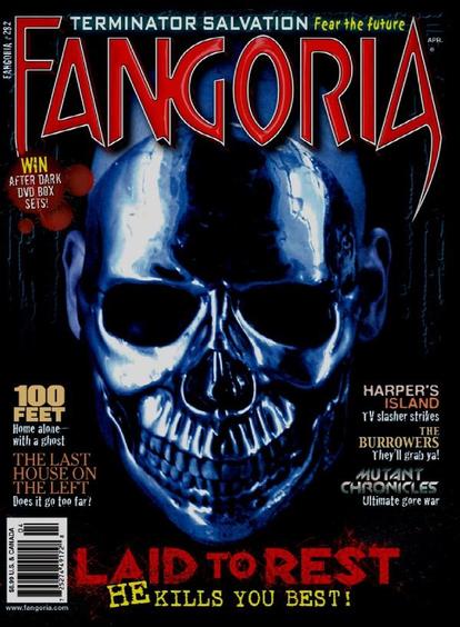
Masthead: The magazine is called Fangoria. The masthead is at the centre of the page in a red sans- serif font which connotes modern. Most mastheads are behind the main image this particular magazine does not follow this convention. However the masthead is unique as the sharp edged of some the letters look like a fang.
Dateline: Is placed to the left hand side of the masthead and it is horizontal. Date is important on a magazine as it makes the consumer aware of the date and year the magazine was published. The dateline is in a sans serif white font on a black background. This enables it to stand out and clear to the reader.
Main Image: There is a close up a metallic face in the middle of the front cover. There are no cover lines which overlaps the image expect half of the masthead yet the main image is clear. The image reflects the thriller genre as you are unaware of the killer’s identity which adds an element of surprise and tension. The low key lighting further creates a tense and anxiety atmosphere.
Cover Lines: The main cover line ‘laid to rest’ is in a sans serif red font and positioned underneath the main image in the centre. The red font stands out as it is on a black background. The red connotes danger as red is associated with blood. The other cover lines are also in sans serif font but a range of colours. They are placed on either side of the main image.
Left Third: The left third is important for sales of magazines as on a shelf only the left third of the magazine tends to be shown. The bar code and main cover line is clearly seen.
Bar Code: The bar code is at the bottom left hand side. The bar code is in the left third as it is important for the consumer to see the price of the magazine.
Selling Line: It is placed at the top of the masthead in white sans serif with blue shadow around the letters. This relates to the picture.
Textual Analysis (Magazine) - Shannon
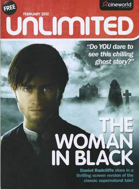
The magazine includes a masthead, selling line, the date and the price. The magazine is free which is good so people can always pick up this magazine to find out whatever happens in the movie world .Also, because it is free it seems like the magazine aims to the working class who generally don’t like unnecessary spending, and the working class are most likely the ones who go to cinemas, I feel that cineworld has acknowledged this. By having the cineworld logo there the audience know that first of all it was written by them and also that they are getting exclusive information because of that and them deciding to attend the cinema. The magazine is a good idea as it will make awareness of the films coming out which increases their cinema profit.
Main Image: first of all this is a medium shot also revealing its background. The man’s eyes stand out because they are blue which connotes he’s quite sad and cold which fits the selling line. The man doesn’t show a facial expression but he does appear distant and serious which creates a sense of tension and mysteries, by the writing on the cover we know nothing other than he is staring in this particular film, it’s unclear who he is, maybe he is the owner of the house which is seen in the distance nevertheless the man shown little emotion therefore its likely for someone to pick out the magazine to find out more. The ghostly figure in the background is also noticeable (but not as much as the man) because the picture of the man was taken in a ¾ angle which allowed space for the ghost and the house, also this way the audience sees the location which is abandoned, nonetheless the white smoke contrasts its black attire which makes the background stand out more. Its unclear why the ghost is there which creates a mysterious and negative atmosphere
Layout & Lighting: The man is at the foreground of the image and he is most likely unaware that the “Woman in Black” is behind him. This is called dramatic irony as the audience is aware that the ghost is in the background but the man is unaware. The man is situated along the left hand side of the magazine cover which creates a sense of him being cornered by this “woman in black”. The lighting is quite dark and this creates a gloomy atmosphere which claims that it’s a horror film. However, one side of the man’s face is highlighted, perhaps there are two sides to this man, and perhaps the light suggests a good outcome as light connotes positity
The cross in the background connotes death and graves, it is right next to the "Woman in black" which implies that she is connected to "this cross"
At first the "woman in black is portrayed as the angel of death, the colour black and the oversized cloak is associated with darkness. the house is placed at the center of the image which connotes that that is the main location for the film, the house appears empty and abandoned but there is 1 light on in the house, possibly suggesting where most of the film is shot and also suggesting that someone is in there
Language: A cover line says, “Do YOU dare to see this chilling ghost story?” this directly questions the audience and it seems quite intimidating, The words “dare” and “chilling” connote that they want to create fear into the audience which will make them want to watch it. Underneath the main cover line, a small summary explains the main image. Using words such as “thrilling screen version” and “classic” suggests that this film will be different to other supernatural ghost films.
Font: The magazine uses white and blue/black text for the main coverline and coverlines.• The white serif text creates a ghostly feel in correlation to the rest of the image. The main coverline is bigger and bolder compared to the rest of the image, this captivates the reader as normally you wouldn’t see a woman in black dressed in a big black cloak. Daniel Radcliffe’s name is a tad bit bolder compared to the rest of the text which entices the audience to read further as he is a popular actor previously starring in the Harry potter franchise.
